Quickstart
This guide provides a basic example of how to use kmeanssa-ng to
perform clustering on a “quantum graph” and visualize the results. A
quantum graph is a metric space where points can exist not only on nodes
but also along the edges, allowing for more granular analysis.
Prerequisites
To run this entire guide, including the visualization step, you need to
install kmeanssa-ng with the plot extra:
1. Generate a Sample Graph
First, we generate a stochastic block model (SBM) graph with two distinct communities. This graph will serve as our metric space.
from kmeanssa_ng import generate_sbm

# Generate a graph with two distinct communities
graph = generate_sbm(
    sizes=[40, 40],  # Two communities of 40 nodes each
    p=[
        [0.7, 0.01],  # High intra-community connectivity
        [0.01, 0.7],  # Low inter-community connectivity
    ],
)

# Note: Distances are automatically precomputed by default.
# The algorithm relies on distances between points on the graph,
# so generate_sbm() precomputes all-pairs shortest paths automatically.
2. Define the Data Distribution
The algorithm quantizes a probability distribution, not a fixed dataset.
We need to provide a set of observations that act as a representative
sample (a proxy) of this distribution.
In this example, our goal is to find centers for the uniform distribution over the nodes of the graph. We thus generate points sampled uniformly from the nodes.
from kmeanssa_ng.quantum_graph.sampling import UniformNodeSampling

# Sample points to serve as a proxy for a uniform data distribution
points = graph.sample_points(500, strategy=UniformNodeSampling())
3. Run K-means with Simulated Annealing
Now, we run the simulated annealing algorithm to find the cluster
centers. We specify the number of clusters (k=2) and other parameters
for the annealing process.
from kmeanssa_ng import SimulatedAnnealing, MostFrequentNode, KMeansPlusPlus

# Run quantum graph specialized simulated annealing
sa = SimulatedAnnealing(
    observations=points,
    k=2,  # We know there are 2 clusters
    lambda0=1.0,  # Cooling rate: higher values mean slower cooling
    beta0=1.0,  # Drift strength: higher values attract centers to dense areas more strongly
    step_size=0.1,  # Step size for center updates in each iteration
)

# Get cluster centers. The robustification strategy ensures these are node IDs.
centers = sa.run_interleaved(
    robust_prop=0.1,  # 10% robustness
    initialization_strategy=KMeansPlusPlus(),  # K-means++ initialization
    robustification_strategy=MostFrequentNode(),  # Choose centers as most frequent nodes in clusters
)

print("Cluster centers (position in edge):")
for center in centers:
    print(center)
Cluster centers (position in edge):
Center near node 44 [edge (44, 48), pos=0.000]
Center near node 23 [edge (23, 10), pos=0.000]
4. Visualize the Results
Finally, we visualize the graph, the data points, and the resulting
cluster centers using the built-in plotting capabilities of
kmeanssa-ng. Note that you need to install the plot extras for this:
pip install kmeanssa-ng[plot].
import matplotlib.pyplot as plt

# Compute cluster assignments for all nodes
graph.compute_clusters(centers)

# Visualize the graph and clusters
fig, ax = plt.subplots(figsize=(10, 8))
graph.draw(
    ax=ax,
    color_by="cluster",
    centers=centers,
    node_size_by_obs=True,  # Show which nodes have more sampled points
    edge_color="grey",
)
plt.title("K-means Clustering on a Quantum Graph")
plt.show()
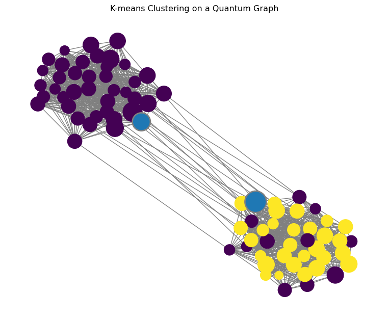
The resulting plot will show the two communities of the graph, with the nodes colored according to their assigned cluster and the cluster centers highlighted.